Accounting Website Design Tips for 2025 and Beyond
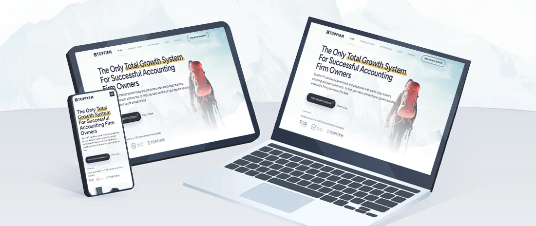
Be honest. When was the last time you updated your accounting firm’s website? Some firms haven’t updated their site since its creation, and if you’re one of them or haven’t updated it in years, here’s the sign to make some upgrades.
Some firm owners may think updating their website is unnecessary, but a modernized accounting firm website offers real benefits. Leaving it outdated could mean losing potential prospects. Your site is more than a digital business card—it’s a 24/7 salesperson, marketing hub, and client portal all rolled into one.
In a world where your first impression often happens online, your firm’s website can make or break your chances of attracting new clients and retaining new ones. But what exactly makes a good accounting website design? How can you ensure that your online presence is doing all the heavy lifting it should?
This guide covers the best practices, essential features, and examples of websites that get it right. By the end, you’ll have a clear blueprint to build or refine your accounting firm’s website, ensuring it works just as hard for your business as you do.
There’s More in Less: Keep it Clean and Professional
The first thing any potential client will notice about your website is its appearance. A cluttered, overly busy website can send the wrong message and make visitors question the credibility of your services.
That’s why a minimalist design is essential. Your accounting site should be visually appealing without being overwhelming and reflect the professionalism and trustworthiness that clients expect from an accounting firm.
A well-designed website makes navigation easy. When visitors land on your homepage, they should immediately understand who you are, what you do, and how to get in touch. You don’t need flashy graphics or complex animations, just a sleek, straightforward design that makes it easy for potential clients to find the information they need.
A good example of this approach can be seen on Xero’s website, which maintain clean layouts that highlight their core services with unnecessary clutter.

Craft a Clear and Compelling Call to Action
Once you’ve captured a prospect’s attention with your design, the next step is guiding them toward taking action. Every page on your website should have a clear, compelling call to action (CTA). Whether booking a consultation, downloading a free resource, or signing up for your newsletter, give your visitors a reason to engage with your firm.
The key to an effective CTA is clarity. Instead of vague, generic prompts like “Contact Us,” be specific about what you’re offering. For example, a CTA that says, “Book a Free Strategy Call” is much more enticing because it tells the visitor exactly what they’ll get.
Position your CTAs in strategic spots, like at the top of your homepage, in the banner, at the end of blog posts, and in the footer of your site, so they’re easy to find without being intrusive.
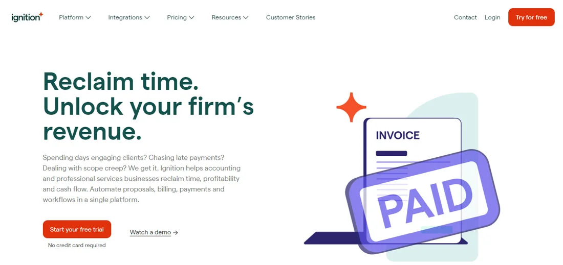
Take Ignition’s website, for instance. They do an excellent job of guiding visitors with well-placed, descriptive CTAs that make it easy for potential customers to take the next step, whether they want to test the product with a free trial or watch how it works with a demo.
Build Trust with Testimonials and Case Studies

92.4% of B2B customers check out online reviews and testimonials before purchasing.
Client testimonials and case studies provide social proof that your firm delivers on its promises. In an industry where trust and reliability are paramount, seeing tangible results can be the nudge a potential client needs to reach out to you.
Here are three types of testimonials that you can include:
Written Testimonials
These can be simple client quotes sharing their positive experiences with your firm. For added authenticity, include their full name and company.Case Studies
Create case studies detailing how you solved a specific client problem and achieved results. This showcases your expertise and highlights the range of services you provide.Video Testimonials
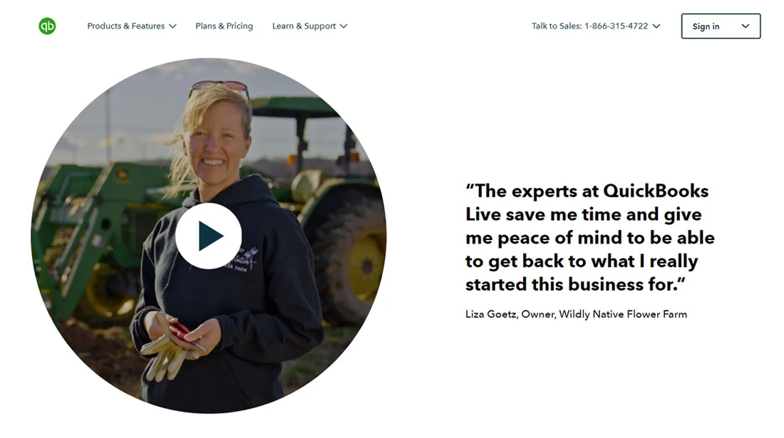
If you want to go the extra mile, video testimonials are the ultimate form of endorsement. They add a personal touch and are far more engaging than text alone.
QuickBooks is a prime example of using client success stories to build credibility and rapport. They expertly blend testimonials with case studies to highlight their impact.
Ensure Easy and Intuitive Navigation
In today’s fast-paced digital world, you have about 15 seconds of a visitor’s attention before they decide whether to stay or leave. If your site is difficult to navigate, you’ll lose them. That’s why intuitive navigation is so important. Visitors should be able to find what they’re looking for without digging through layers of pages or getting lost in confusing menus.
A simple, clean navigation bar at the top of your site is essential. It should include the main sections visitors need, such as:
- Home
- About
- Services
- Contact

Subpages can be organized under these main categories, but keep the structure simple. Internal links throughout your site make it easy for visitors to navigate and stay engaged longer.
Look at TOA Global’s website for an example of how easy navigation should work. Their clean layout makes it simple for visitors to explore their solutions, read about the firm, and get in touch without any guesswork.

Highlight Services with Client-Focused Pages
Your service pages shine a light on what makes your firm unique. But listing out your services like a menu isn’t enough. You need to use these pages to speak directly to your clients’ needs, explaining how each service helps solve their problems and improve their business.
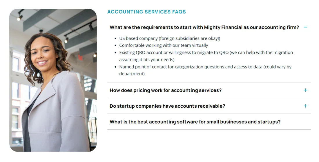
Instead of focusing solely on what you do, focus on how it benefits your clients. For example, rather than listing “Tax Preparation,” explain how you help businesses save time and reduce tax liability through proactive planning. Including frequently asked questions (FAQs) on each service page is another great way to anticipate client concerns.
Mighty Financial’s service pages offer a great example of client-centric content. Each page is rich in information and written to show an understanding of the client’s challenges, making it clear why Mighty is a great choice.
Make Sure It’s Optimized for SEO
Let’s not forget the importance of search engine optimization (SEO) in ensuring your website actually gets found by potential clients. SEO might sound technical, but it boils down to making sure your website is easily discoverable by Google, which helps your firm get noticed by the right people.
On-Page SEO
Ensure your website’s metadata, headers, and image alt tags are optimized for relevant keywords.Content Creation
Regularly put out high-quality, relevant blog posts addressing your clients’ questions and pain points. Not only does this build trust, but it also improves your site’s ranking over time.Local SEO
For most accounting firms, your local market is your bread and butter. Optimize your site for local searches by including your city and region in key areas like title tags and meta descriptions. Don’t forget to claim your Google Business Profile while you’re at it.
Make it Easy and Simple to Contact You
Finally, don’t underestimate the importance of making it easy for clients to reach you. Your contact page should be straightforward and offer multiple ways for clients to reach you. The process should be seamless whether they prefer to call, email, or fill out a contact form.
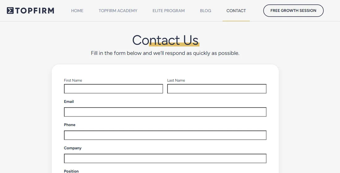
Utilizing a scheduling tool like Calendly can make it even easier for potential clients to book time with you directly. Don’t forget to ensure that your contact information is visible across your website, not just hidden away on one page. Clients should never have to search for a way to get in touch.
Here’s Your Sign to Update Your Accounting Website
A well-designed website is one of your accounting firm’s most powerful tools. It’s not just a transactional platform—it’s a key driver of growth and client engagement. By optimizing for user experience and incorporating these elements, your website will attract clients and support your firm’s growth.
As a CPA coach, I can’t emphasize enough the importance of getting your accounting website design right. It’s an investment worth making for the future of your firm.
About the Author:
Nick Sinclair
Founder – TopFirm
Nick Sinclair is a visionary leader in the accounting industry, dedicated to helping CPA firm owners unlock their true potential. With 20+ years of experience, Nick has built an impressive career as an entrepreneur, coach, and former owner of an accounting and financial planning firm. He has founded transformative companies like TOA Global, Ab² Institute of Accounting, and TopFirm, collectively empowering more than 1,100 firms worldwide.

